Queens, NY
8 December 2008
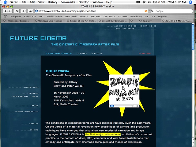
Amid ever slicker websites selling this, promoting that, and informing you about those, Zombie & Mummy layers old-school graphic satire that tells a funny little story. Literally, in fact, as this project copies preexisting webpages and collages small cartoon story boxes into their midst. One navigates the site by choosing from several paths—“Zombie & Mummy make a homepage,” “Zombie & Mummy celebrate Christmas,” “Zombie & Mummy go to ZKM,” to name a few—and then finding the corresponding comic scroll smack where it doesn’t belong. The juxtaposition between the cartoon’s scratchy, layered, black-and-white drawing style and the digital smoothness or tackiness of the sampled websites is stark, as is the way one navigates the comic story: by scrolling to the right, more akin to the experience of looking at a Chinese scroll painting than a computer screen. Scrolling was a noun before it was a verb. The surprise of finding these stories would be all the bolder, however, if “Zombie & Mummy” were hackers instead of makers of their own site: imagine finding their tale as a pop-up window the next time you visited Amazon.com.
—Lori Waxman
